Mistakes in Arranging a Painting.
Look for mistakes in your paintings.
Mistakes in the arrangement can stop a painting from selling.
First you need the painting to catch someone’s eye.
The viewer’s eye will travel into and around the painting. ( by viewer I mean potential buyer )
The painting arrangement needs to keep the viewer looking.
There are certain tricks we use to keep the viewer looking.
Let’s start with a simple but important aspect of a successful painting.
Arranging a Painting to Catch The Eye.
No bright spot.
This is possibly the most common mistake in arranging a painting.
At first glance, before focusing, the viewer will be attracted to a bright spot or bright area in the painting.
From there they will focus and scan around absorbing the scene.
Without this bright-in-the-middle thing you may be missing out on genuine comments or sales.
To catch a viewers eye we need to ensure the painting has a bright area somewhere near the middle or pointing into the middle area.
Compare these drawings.
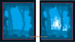
This white area might attract the viewers eye OUT of the picture, therefore it is best to have a whitish area appearing to be pointing in.
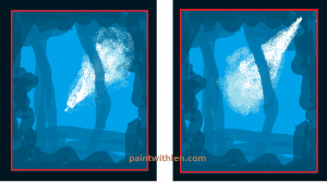
Try glancing at these blue images and see what attracts your eyes.
It’s the white. And then your eyes will wander, hopefully not off the picture.
The glow from the painting
This white or almost white glow area can be the bottom of the sky or the water may appear white in the distance.
Sometimes it is a combination of sky, water, grass or buildings which give us the glow.
The point is, if you don’t have it, your paintings will look dull.
Find the glow in John Constable’s paintings here.
Mistakes made when placing objects in the scene.
Here are some notes listing common mistakes made when placing things in a landscape painting.
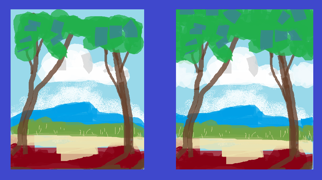
Placing things evenly spaced. Does not look natural.
The trunks of background trees are the most common mistake for equally spaced. They are usually small but should not be placed equal distances apart.
Birds, rocks, clumps of grass, trees, in fact almost everything in a landscape painting should be placed randomly as in nature.
Don’t put the horizon line, eye level, exactly half way up the canvas. It cuts the picture into top half and bottom half.
Everything facing in.
Houses, sheds, people and animals should face into the picture and not to the nearest side.
Everything leaning in.
Trees, posts and anything that attracts the eye are best leaning into the middle slightly.
Prominent branches should not lead the eye out of the painting.
These notes can be used to check if there are mistakes in your arrangements.
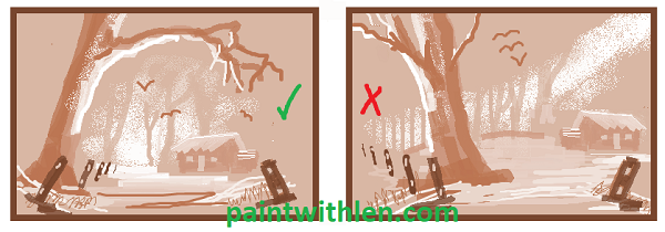
Some mistakes in arranging a painting of a landscape are shown in the image.
Do not chop to fit.
Do not chop the tops of the trees to fit inside the canvas, trees may go well beyond the captured scene. Clouds should not be molded into the area of the canvas, they may come in one side and out the other.
Nothing dropping off.
Do not dip the mountains and background trees down at the edge of the canvas otherwise the viewer’s eye will be attracted down and off.
Avoid pointing off.
Avoid anything that the eye might be attracted to that is pointing off the canvas. Sticks and branches can be used to attract the eye into a scene. If something is pointing off, an item could be added so as to stop the eye wandering and bring it back into the picture.
A bird in the sky may be used to attract the eye back into the picture.
Avoid vertical river banks.
Avoid river banks running straight towards you. They can look like the water is standing up.

See more about this here.
Roads.
If a road or track disappears off the side of a painting, the viewers eye will surely follow it.
Measures should be taken to distract the eye and bring the viewer back.
Leave the middle open.
Do not place anything right bang smack in the middle of a scene.
If something is needed in the middle then put it off center.
Usually you will need the viewer to focus on one area of background and that should be the biggest and brightest area of background.
If you have something in the middle of the painting then you have two areas of background and the viewer doesn’t quite know where to look.
Don’t leave spaces.
Don’t leave empty spaces on the edges or in the sides of a painting.
In the middle it is okay to have an empty space.
Empty spaces can attract the eye and you want the eye attracted into the middle.
See the image here.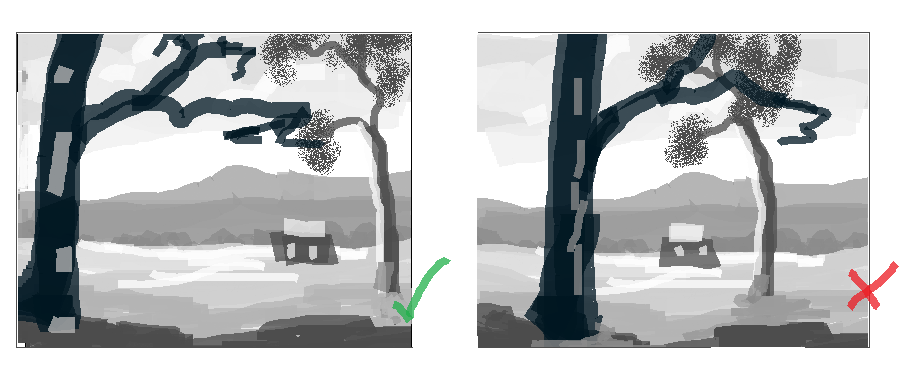
Other related pages are here, height of the horizon line, perspective and colors or tones of colors.