Painting Tones and Colors.
What is the meaning of tones of colors when painting?
To be a successful landscape artist you must learn about painting in the correct tones and colors.
Paint with one dark color and white and you will see how different tones are needed to give depth to a painting.
Paint the background with white, tinted with a little color to give a very pale tone of that color.
Then, as we come forward, the middle ground will need to be painted in darkening tones.
The foreground in the full color, vibrant with a few white highlights.
In brief, dark tones look close and light tones look further away.
You can have many different tones of the same color.
- The word – Tones.
You can think about tones like this. Pale tones mean pale color, any color. - Black with white added is a paler tone than pure black.
- And the same goes for any color.
- Bright tones mean bright colors, any color.
Spend some time thinking about how colors fade into the distance. Don’t ignore it.
- Tones of colors is a bit like the weather.
Some days are warm, some days are cool.
Some days are cool but warm compared to other days. - Pure black can be called a bright tone or you might call it a dark tone or deep tone.
- Warm tones are colors closer to red.
- Cool tones are colors closer to lemon yellow.
- A color can look warm when placed next to a cool color and cool when placed next to a warmer color.
- Fire engine red is warm red, crimson is cool red.
- Ultramarine blue is warm blue when placed next to other blues.
- Cobalt blue is cool blue.
- Lemon yellow is cool.
- Warm yellow looks more like an orange than a lemon.
By carefully painting with the correct tones and colors you can give your painting a three dimensional look.
- When using pale cool tones in the background and bright warm tones in the foreground of our landscapes we can have a three dimensional look.
- Try painting bright warm red dots over bright cool blue background. The dots will appear to be standing well above the background.
- Blue tones, red tones, grey tones, a reddish brown tone, cool tones, warm tones, bright tones, dull tones, vivid tones of green.
- You might say -tone- is another word for color but it usually refers to the amount of color.
- Tone your colors down means make them softer or duller, usually by adding white.
- Possibly the mistake I most often see in a beginner’s landscape is the misuse of tones, or not enough variation of tones.
- Landscapes should be painted with pale tones in the distance and darker tones in the foreground.
- You cannot have a dark blue mountain behind a light blue mountain, it just does not happen.
- And that goes for everything in the landscape, things get paler as they move away until everything becomes the same pale, faded grey or blue.
- A brilliant green tree in the distance must be of a paler tone than the white tree in the foreground, the white is vibrant, and the green is dull.
- A fire engine next to you is brilliant red but when it has driven away say fifty yards, it is crimson and as it drives further away it will fade into the same grey as everything else in the distance.
- On a foggy day it will turn grey within a few yards.
- Bright red is a foreground color and should not be used in the background of a painting.
- That color you see everywhere in nature that is not red or blue or yellow or any other common color, is grey.
- When the three primary colors join they make grey.
- So we have blue grey, red grey, green grey and endless variations of grey, take out the yellow and we have mauve and purple, add more reds to the grey and we have red browns and add yellow and blue to that and you might have a color that looks black.
- So the possibilities are endless. In a landscape the colors with which you mix your grey should continue through the painting.
- You need to be careful if you change your basic set of colors half way through the landscape.
- For instance, cobalt blue hills in the distance will gain crimson and then yellow as they come forward, you should not add ultramarine blue or mauve to change the tones when those colors are not already throughout the painting.
- Mix your colors from a limited palette.
- Arranging the tones in a painting can be a formula.
It is not random colors but a definite rule which falls into place like a prescription. - By adding an alien color can spoil the look of a painting.
Tone colors down.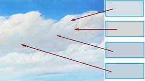
Red Blue Yellow
Tones of colors is a stimulating subject when you realize how it works.
- Generally, an area of bright tones is needed somewhere in the middle of the painting, the edges of the painting should be of darker tones and the corners should hold the darkest tones.
- Combine this with everything pointing into the picture and you will catch and hold the viewer’s eye, even if it is a painting of nothing.
- By ‘everything pointing into the picture’, I mean trees leaning in, cottages facing in, mountains sloping in on the edges, fences getting bigger as they come into the picture and figures facing into the picture.
- If an object like a tree must lean out of the picture then another object needs to be placed to catch the eye and lead it back into the picture, this might be a cloud or a bird or foliage.
- When viewing an old master, you will see how the tones are arranged to trap your eye, squint, and you will see a definite glow coming from the painting.
- With the glow is near the edge of the painting, when you fully open your eyes you will see the items have been placed to attract your eye away from that edge of the painting.
- In most paintings the glow is near the center.
- Finally let’s think back about a black and white image.
It is all made up from different tones of the color black.
Without a variation of the tones of black the whole image would look black.
When painting in colors you must have these variations of tones in all the colors.
You may Comment below.
Go back to the top.
Go to – HOME – FREE LESSONS – ABOUT PAINTING – DIRECTORY OF PAGES – CONTACT LEN – LEN HEND SALES
See HERE the 70 lessons on flash drive
>
Love your down to earth style of teaching. I am very grateful for the amount of free information that you share and I really appreciate the amount of time and effort that you have put into these lessons.
Heartfelt thanks.
Thank you Audrey
Thank you Janet
Wonderful lessons. Accessible style of teaching. You make everything clear. Thank you